Dark Sky vs. Forecast.io
/Dark Sky, genius short-term hyperlocal precipitation forecasting app du jour recently underwent a major update.
The Dark Sky team have achieved something quite incredible with their short term forecasting algorithm and their prediction technology has gone on to power a host of other apps. Their radar map visualisations are also both beautiful and functional:

Yup, it's pretty rainy in London
The update was designed to increase the app's scope from its short-term rain-predicting accessory role to fully fledged Main Weather App. But the new design isn't quite as lovely as it could've been and there have been a number of blog posts analysing its issues.
Personally, I think Jared Sinclair's critique is broadly accurate, particularly his thoughts on the lack of axes on the second screen:
On the second panel, the 24 hour temperature graph doesn’t have any bounding guides or axes to give the graph meaning. It’s just a line meandering through negative space. Graphs need axes to be legible.
This snippet hints at the main problem with the app – the difficulty in parsing the visual information, especially where graphs and scales are involved. This is a rather damning indictment for a weather app.
These are hardly insurmountable issues, but they are surprising given that the Dark Sky team launched a fully featured multi-platform weather web app almost a year ago (that clearly informed the Dark Sky update) that is considerably better designed and laid out: Forecast.io.
The most vital part of Dark Sky, the launch screen, is fine, but a quick look at Forecast's launch screen shows you things could be better:

Dark Sky
Forecast
Showing the radar map through the 'glass' of the first screen is clever and gives a nice glanceable hint as to how stormy the area currently is. In my case this afternoon: very.
Beyond this, Forecast is superior in every aspect: it shows the 'next 24 hours' summary on the same screen, it shows an animated symbol for the current weather rather than an arbitrary black circle and it also includes the degree symbol on the main temperature number. That last point might seem minor, but every time I open Dark Sky the lack of units on the big unadorned number always gives me pause.
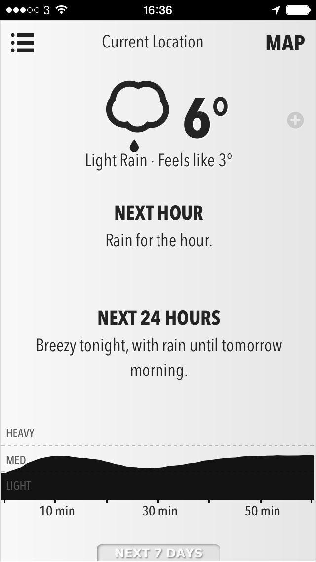
However it's Dark Sky's second screen – 'next 24 hours' – that's the most problematic:


The precipitation graph ('the sky') is tricky to read and a few questions immediately present themselves:
- Where are we now on the graph – where is the current time?
- Why are the precipitation percentages below the time increment markers?
- Why don't the percentages line up with the time markers?
In Forecast, this graph is accessed directly on the first screen by dragging the next hour graph to the left. This communicates important information about the temporal relationship between the two representations: the coloured blocks start with the hour immediately after the end of the animated next hour graph. This is not at all clear in Dark Sky.

Mid-drag between the first two screens in Dark Sky
As can be seen to the right, when swiping between the two screens the transition animation and lack of common vertical alignment breaks any visual connection between the two.
As Jared notes above, the temperature line is even harder to parse. Only Weather Line has ever really pulled off this style of temperature change representation well and the desire to include it in Dark Sky seems to have prompted the decision to move the next 24 hour information on to a second screen of its own.
Forecast includes this temperature information on the precipitation bar itself. To me, this makes a lot more sense than the line-in-space of Dark Sky.
Dr. Drang mostly defends Dark Sky in his blog post about it, but does have some criticisms, all of which I agree with. One in particular is relevant to this post – Dr. Drang suggests that the detailed secondary weather information revealed by tapping on the black circle in Dark Sky could be more concisely presented elsewhere:
They’d have been better off taking a cue from Apple’s weather app and having this text fill just the top portion of the first screen when tapped. That would also allow the user to connect this secondary information with any upcoming storm because they’d be on the screen at the same time.
Well wouldn't you know, that's exactly how Forecast presents this information:

After tapping the black circle

After tapping the temperature or plus symbol
A final issue is present in the timeline for the live radar map. It's minor, but which of these is easier to understand?

Dark Sky - the red indicator is draggable and controls the animation shown above this bar.

Forecast - the black indicator is draggable, with the red indicator remaining static to indicate the current time.
Forecast makes a misstep here too, choosing to use an odd 40 minute scale. Dark Sky fixes this but adds fresh confusion by positioning the labels exactly bisecting the indicators.
In addition, when dragging to animate the radar data, Dark Sky gives no indication of the current time making it difficult to work out exactly how the image above relates to the present conditions outside. This is exacerbated by both the indeterminate time labelling and the physical position of the bar. In Dark Sky, it's impossible to manipulate this slider without your thumb obscuring the indicator's position. In Forecast there is room enough underneath the bar to avoid this being an issue.
As a heavy Forecast user and lover, I was excited at the prospect of a native app with the same functionality. The update to Dark Sky should've allowed me to delete Forecast from my Home Screen but it seems like I'll have to wait a little longer.
The data visualisation difficulties present in the iPhone app update are especially frustrating precisely because the team had already nailed them in Forecast almost a year ago. Hopefully some of these clearer and more intuitive representations will come to the new Dark Sky soon and I can finally make a permanent switch.