

iOS and Android apps
Solo lead and later paired with a UI designer to scope, design, prototype and user test a total app redesign to make finding and buying the right tickets easy. The app launched to high app store ratings and now has well over 10 million installs.
Trainline are the largest online ticket retailer in the UK, but their focus had primarily been on the desktop web. Whilst they did have existent smartphone apps, both were first generation designs that were slow, dated and confusing (sneak peek).
The new apps are designed to make buying the right tickets easy, and to provide live train times and travel information in way that's easily understood and attractive. I worked closely with an integrated cross-functional team in a fast moving Kanban environment to deliver the work.
All areas of the app's UX and UI were overhauled including the primary search flow, ticket options, payment, ticket wallet and all scheduled and live time displays.
This app is currently live and available now.
Design and iteration
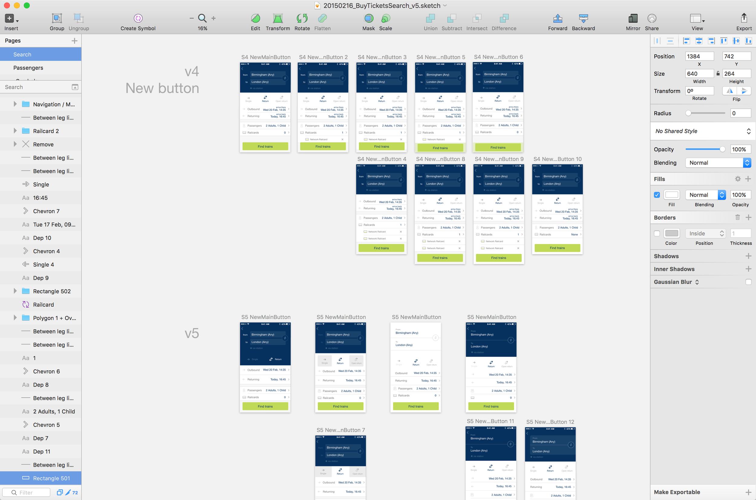
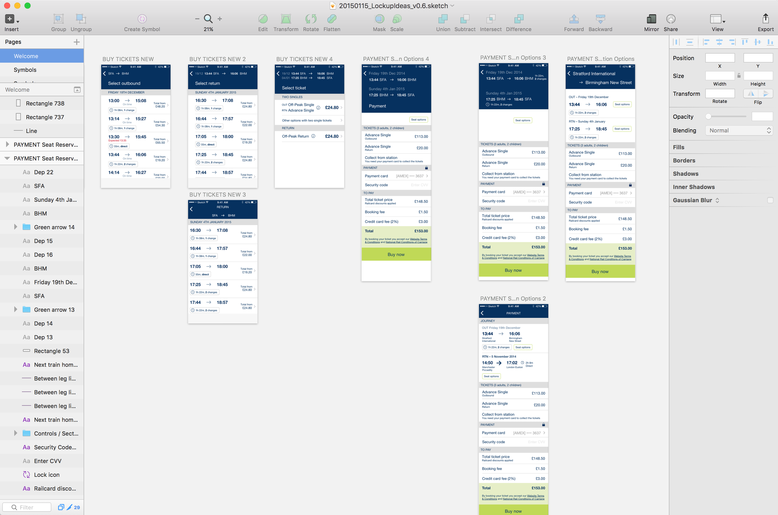
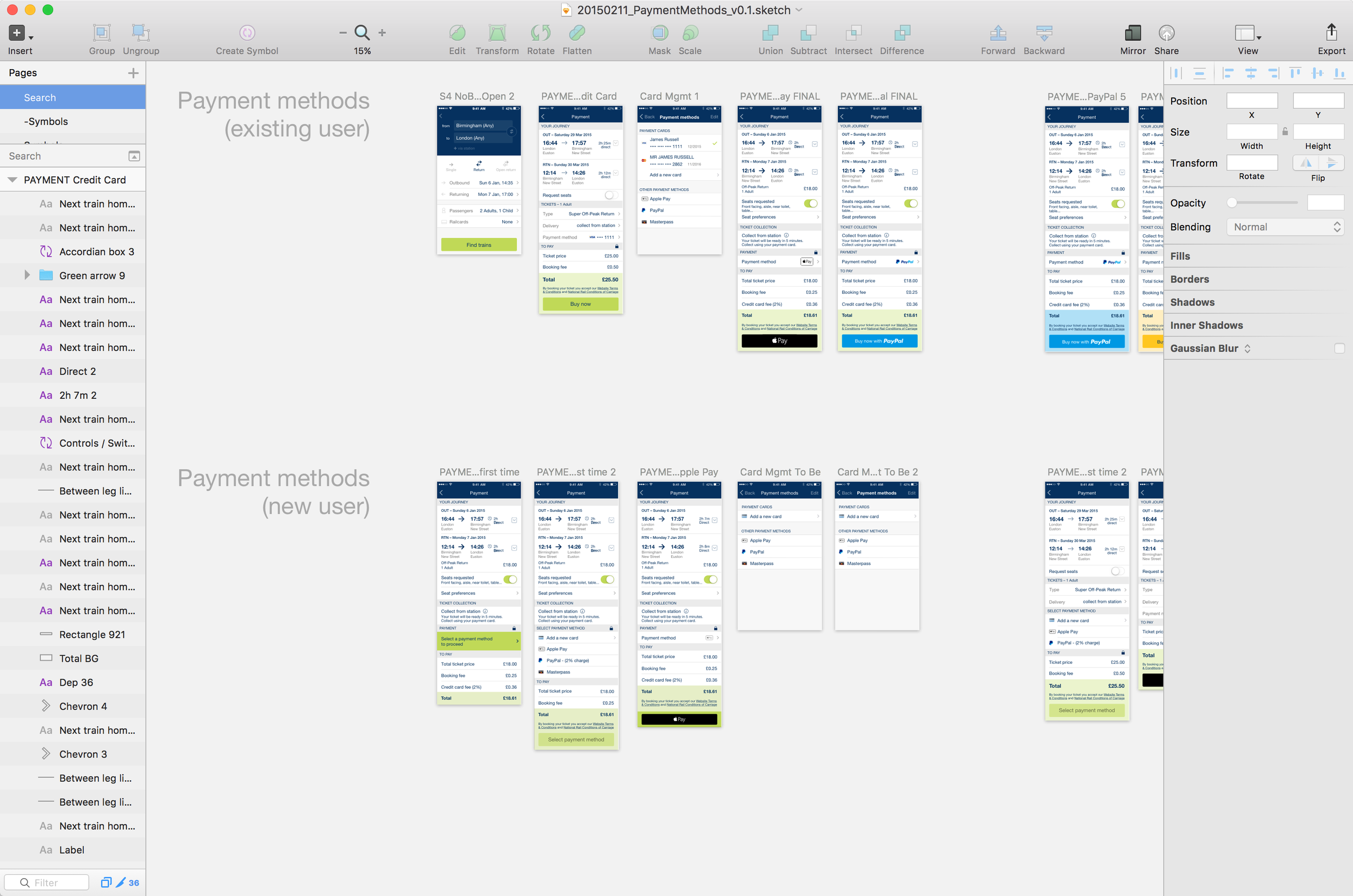
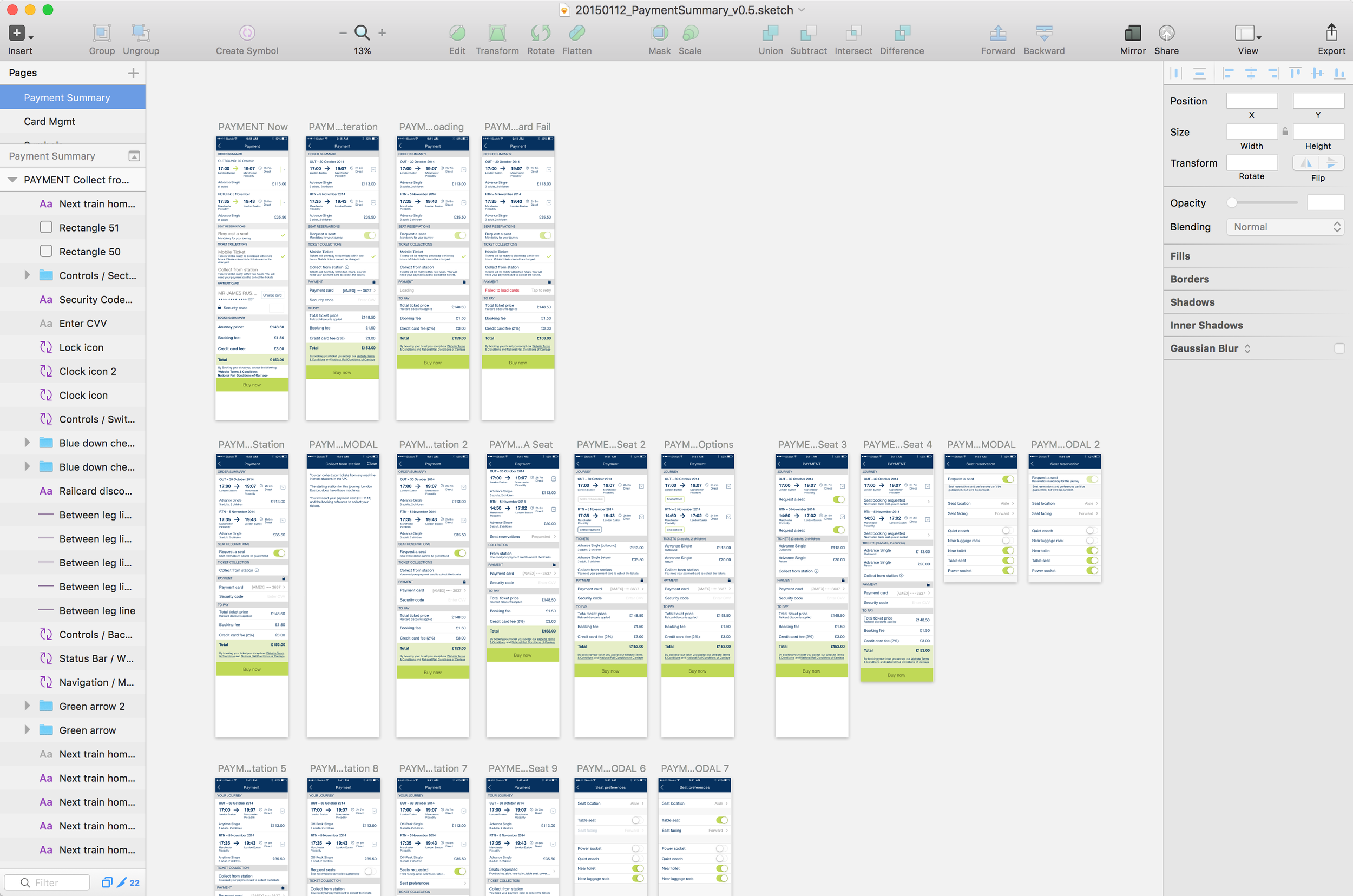
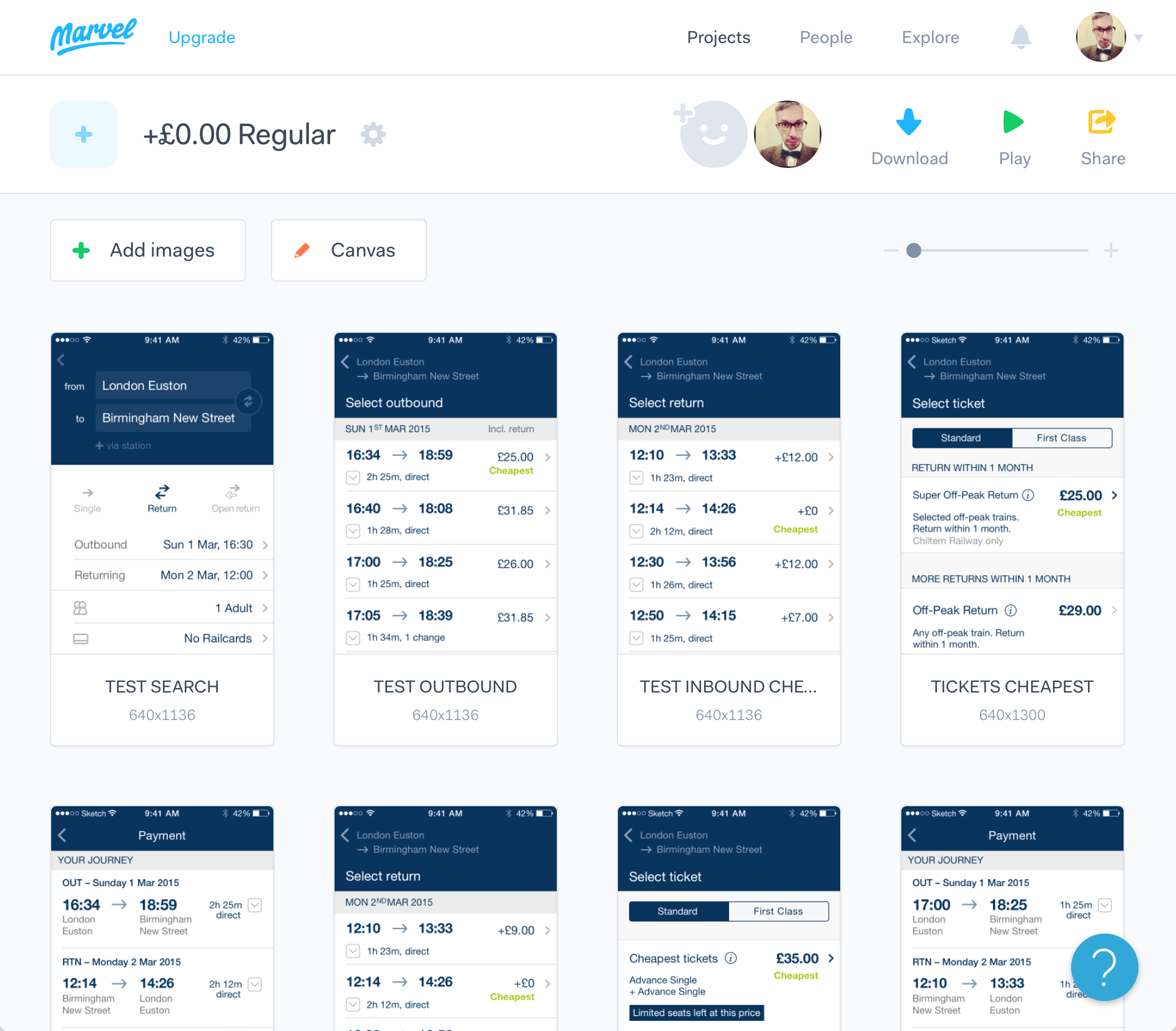
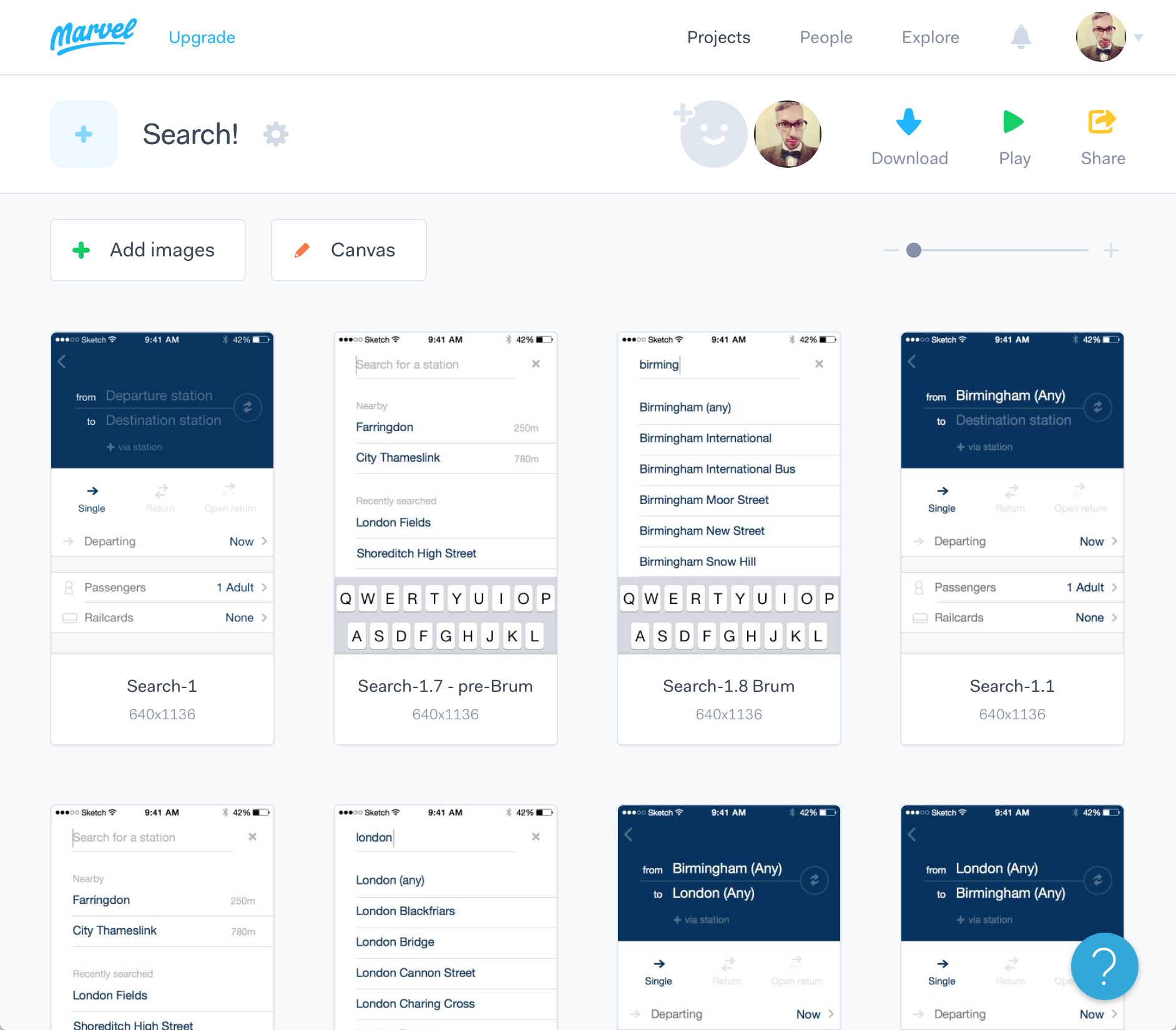
The majority of the design work was done in Sketch and Marvel. A few screenshots showing the many iterations and layouts explored can be seen below.
Effort was made to keep the app's capabilities, UX and UI similar and familiar between iOS and Android whilst still respecting the appropriate HIGs and visual flourishes: Apple's iOS7+ guidelines and Google's then new Material Design framework.
Prototyping & user testing
Extensive prototyping and user testing was done using Marvel.
Train ticketing in the UK is absurdly complex due to the mixed private/public nature of the railways and the multiple providers and ticket types for each route. This made continuous testing vital to ensure we were succeeding in untangling that web for our customers.
I created all our prototypes and ran twice monthly test sessions in order to test new user flow ideas and validate existing designs.
A big challenge for trainline was to try to make the best option clear for a given journey whilst still presenting flexible ticket choices without becoming confusing.
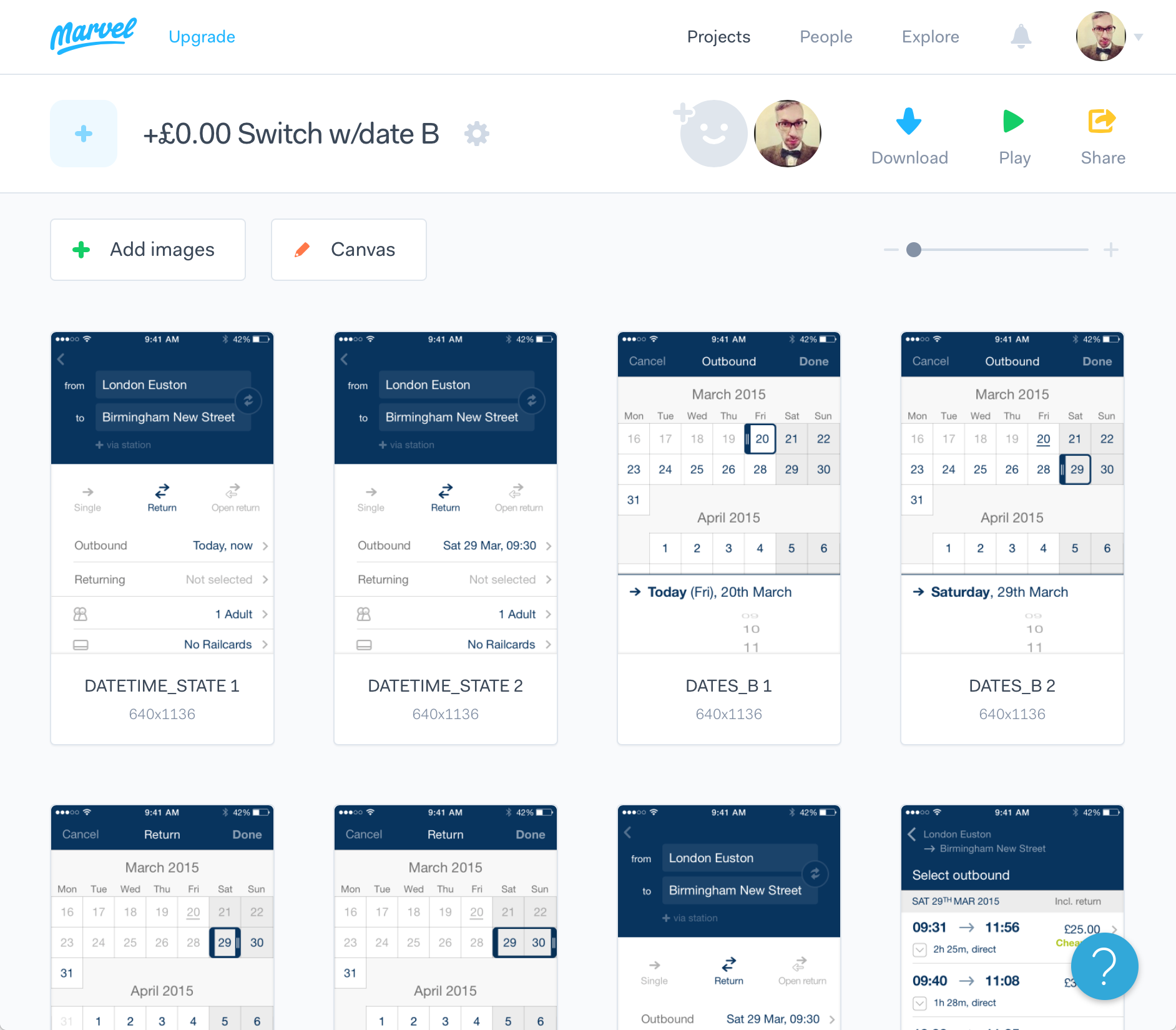

Interaction design
The transition between the journey search screen and the results needed to fulfil a number of criteria:
Smoothly transition between two significantly different page layouts
Take up ~1 second of time to cover the loading time for the results
On iOS: retain the left edge swipe to return to the search query page.
I used Framer plus assets I'd created in Sketch to design and iterate this transition and then used the timings and component breakdowns to help the developers build it.
Screenshots & download – live app
Now with further visual iteration including a new corporate typeface and colours since my departure.
iPhone


Platform
Android and iPhone
Deliverables
Prototypes
Interaction design
UI