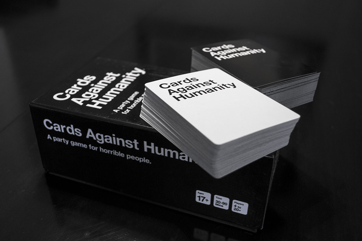
Cards Against Humanity
/
Nice piece about how Cards Against Humanity happened. I had no idea it was so insanely successful:
At $25 per copy, the original game has likely generated at least $12 million in revenue since 2011 (the company won’t give sales figures). Industry experts estimate the game costs less than $10 to make, sell and distribute. The Chicago-based company behind Cards hasn’t spent a dime on marketing and has no full-time employees.Two extra bits of genius have also helped - they made a PDF of the game available free - the ultimate form of viral marketing for the 'real' game:
Customers have downloaded PDFs of the game ... 1.5 million times since the founders began tracking the number last year.
And, somewhat accidentally, their choice of controversial subject matter has probably put off mainstream gaming companies from copying the game.
Boardgames and especially ones that only involve cards are an interesting niche. The production costs are so low and scalable, and with Kickstarter available to generate funding, if you have a great idea that people want: it's relatively easy to make happen.