#music #fail

Twitter's new #music service uses your social network to crowdsource recommendations for you.

Stop me if you've heard this one before.

The idea behind Twitter's new website (and iOS app) seems to make sense, albeit as a latecomer to a saturated arena. However, it's based on a number of flawed notions including a reliance on Spotify or Rdio that ultimately undermines it completely.

It requires the following to be true:

  • Users follow or want to follow the artists they like.
  • When hearing a song they like, a user's first thought would be to tweet about it... but not save it in any other way.
  • Twitter has a reasonable chance of guessing the music you like through who you follow.

I don't believe any of these hold.

The first two aren't insurmountable problems and I'm sure features to address the second issue will come soon... but the third point is critical.

On Twitter, I follow professionals related to my career, I follow celebrities, scientists, politicians and musicians related to my interests and hobbies and I follow real life friends and other online acquaintances.

Some of the people I follow are huge music fans and some of those might have the same taste as me, but ultimately Twitter has no way of pulling any signal at all from that noise. In fact, you'd be considerably better off starting a dedicated second Twitter account for #music and ONLY following artists you like from that one.

More fundamental even than that though: you need to use Spotify or Rdio to even listen through the service... at all.

Guess what problem Spotify already solves without any help from #music?

Overpowered crafting undermines the core role-playing game experience

The Heart of Ember: an awesome looking hammer you won't be using

If your RPG-esque videogame includes a crafting system that allows you to create gear that is better than 99%+ of drops, a lot of the fun and skinner-box-dopamine-draw of exploring and completing quests vanishes.

This is perhaps the most significant problem with Kingdoms Of Amalur: Reckoning and an important one in Skyrim. Allow me to explain...

A recent article on The Verge about the testing of Borderlands reveals the truth of the situation in the aforementioned games:

"For instance, Borderlands is a game about wanting things," Armstrong explained. "But one of the common things we hear people say is 'Boy, I'd like to build my own gun.' Okay, you can build your own gun. Now the game's over, congratulations. The quest for the perfect gun is over."

Precisely.

Worse, in these games, especially Amalur, the unique items all have unique artwork and look totally awesome: this doubles the disappointment when they are unusably inferior to the generic looking sword you crafted a number of hours of gameplay earlier.

Why go to all the effort of designing badass looking unique items if a significant majority (blacksmithing is so obviously the most interesting skill in the game) of the players of your game will never be excited to find them nor be reasonably able to use them?

In addition to this, it breaks immersion in the world and storyline. In Amalur, the player is able (and must, for a time) wield a legendary weapon during one of the well written faction quest lines, but guess what? It's comfortably inferior to anything you could craft by that point in the game. After the quest I swapped back to the sword I'd knocked up on the anvil at a local village earlier: not especially satisfying.

Skyrim has similar problems and they're compounded by something that the Elder Scrolls series refuses to let go of completely: dynamic content. More on that in a future post, I think.

Blizzard, in Diablo and World of Warcraft mostly have this nailed. They solve it with a two pronged approach:

  1. The very best crafted items are worse than the best that can be obtained through adventuring.
  2. The level of effort required to craft items is on an exponential curve; easy and mid-level item ingredients are relatively easy to gather, whilst those for the very best items (those that rival some of the high level dungeon drops) are approximately as hard to obtain as their equivalents would be through questing. 

This second point is another area that Amalur and Skyrim fall down on: crafting endgame quality gear is barely any more effort than crafting basic gear. Yes, it requires more exotic ingredients but they are all readily available in shops or, somewhat ironically, via salvaging regular dropped loot.

Overall, Blizzard's solution works nicely: it allows the player to fill stubborn gear gaps (with some effort) but doesn't ever take the excitement out of completing dungeons. Considering Amalur appropriates so many elements from World of Warcraft (something I'm totally ok with, Everything Is A Remix and all that), it's surprising they didn't pay closer attention to the area that Blizzard has argubly spent the most time, years and years of iteration in fact, to absolutely nail.

If you're going to create a honed genre piece, for that is certainly what Amalur is: please try a little harder to properly nail the absolutely defining characteristic of that genre: the everlasting quest for that next gear upgrade.

Where is pull up to refresh?

Pull-down-to-refresh was pioneered in Loren Brichter's Tweetie (now bought and remodelled as the recently not-so-great official Twitter iOS app).

This makes sense because Twitter lists its content in reverse chronological order, with the latest posts at the top. When you're scrolling towards the top of your stream (by dragging down) to check the latest posts, it's natural to continue the action and trigger the refresh.

This is not the case, to use the most obvious example, on a Facebook comment thread in the Facebook iOS app where the latest comments appear at the bottom. I scroll to the bottom to read the latest comment then have to scroll all the way to the top, and past the top, to trigger a refresh... which I then have to scroll all the way to the bottom to read. Why?

This can get pretty frustrating on long and relatively active comment threads and doesn't make any sense. It would be far more natural to just be able to scroll past the bottom of a comment thread and trigger the refresh that way.

The only possible defence for this is that Facebook also does legitimately use pull-down-to-refresh in their inbox and on the notifications list (where the items are newest first) and thought that it would be confusing to incorporate both methods in the same app. I don't buy that for a second though: I bet some users don't even realise you can pull-down-to-refresh on oldest-first areas of the app like comment threads - after all, it's pretty odd to scroll up past the top of the original post to do this at all.

Does anyone know of any apps that have newest last lists that do use pull-up-to-refresh?

Update: The latest version of the Facebook app has removed pull down to refresh from areas that update at the bottom of lists.

Musings on (OS X Lion) scrollbar alternatives

Alas poor scrollbar, we knew thee well.

Will Windows 7 be the last mainstream OS to use the elevator + track + clickable arrows UI element for scrolling? Given where Microsoft are going with Metro and Apple with homogenising elements of iOS into OS X, it seems eminently possible.

OS X Lion replaces the traditional scrollbar of Snow Leopard with the slim lozenge from iOS... and most significantly: hides it by default.

A good summary of the usability disadvantages of this behaviour are made halfway down this page of John Siracusa's in depth Lion review.

Jon Whipple has an idea he calls the 'Scroll Compass' (found via Daring Fireball) to solve these problems, although as John Gruber notes, it brings with it its own problems: mainly that it's an arbitrary new interface abstraction.

The other issue with the Scroll Compass is that it clashes with Apple's current drive towards making OS X feel more physically 'real' and directly touchpad manipulable through bringing iOS interactions to the desktop. The most significant of these in Lion is the switch to 'natural' scrolling and the adjustment of other gestures to be naturally mapped to the user's touchpad actions.

As soon as I read Jon's post I had the same idea that numerous posters in the comments also had: why not indicate there are extra items off screen by modifying the window's background directly?

This has a couple of advantages:

  • It makes the background look more like a physical object inside the window, reinforcing the behaviour of natural scrolling.
  • It's not an abstraction: it's actually suggesting the presence of extra content directly via a psuedo-physical visual cue.

To my mind, there are two obvious implementations of this idea:

  1. Modify the edges of the background so that the very edges are marked with a subtle frame. When these elements aren't visible on all 4 sides, the user knows that they can scroll, and in which direction.

    The primary gotcha with this is that it can't maintain the physical illusion in the face of a user adjusting the window size to larger than the document size.

    The frame would of course stick to the edges of the window but that also means it would move resize, subtly breaking the concept of there being a real physical background present.

  2. Use a drop shadow or gradient effect just inside the edges of the window so that it appears to be slightly raised / separate from the background, subtly indicating where the background extends 'under' the window in a given direction.

    My Photoshop skills definitely aren't up to this task*, but I'm certain a more talented UI artist could devise a subtle but definite visual indicator that could be very effective used in this way.

    Nevertheless, here are some examples I've attempted:

An unadulterated Lion Finder window

An unadulterated Lion Finder window

A Finder window hiding content to the left, top and right

A Finder window hiding content to the left, top and right

A Finder window demonstrating it can be scrolled downwards

A Finder window demonstrating it can be scrolled downwards

With cues like these in place, the user knows they can scroll, and as soon as they do, the iOS style lozenges appear and impart the rest of the missing information, and are available to be grabbed.

The significant limitation with both Jon's idea and the ideas I've visualised above come when you get to the web.

Although a drop shadow or gradient (fading to transparent) could work well for the vast majority of websites that scroll within the browser window, it would be difficult to apply to the appropriate elements on pages that have scrollable areas within the page. 

Having said that, this is also a page design that behaves poorly on iOS already, both through lack of discoverability and because the vast majority of iOS users don't know that you need to perform a two finger drag action to scroll areas within a web page.

Nevertheless, with appropriate iteration and testing, I think a gradient style implementation could very subtly enhance the physicality of Lion windows whilst adding some of the visual feedback lost with the new default scrollbar behaviour back in.

* Apologies to Jon for Photoshop abuse of his Finder window image, which I hope he doesn't mind me borrowing for demonstration purposes.

Facebook vs. Twitter vs. Google+

I've read a lot about Google+ this week but nothing that accurately articulates precisely how its model differs from that of Facebook and Twitter.

The fact its user interface looks a lot like Facebook has led people to assume the services are similar. This isn’t really the case – in fact Google+ is a lot more like Twitter than Facebook.

This post sidesteps the broad functional differences between the services (e.g. Facebook event management, Google+ 'Sparks') and focuses on the status update/post/stream aspect of things.

So let’s get started shall we?

Facebook

- Facebook is based on a symmetric model.
- Everyone you are friends with is also friends with you.
- Friends can be assigned to 0 or more ‘Friend Lists’.

Incoming
Your incoming stream (called your “News Feed”) is a list of all the posts of all the users you have as friends.

By default, Facebook filters this stream based on the users you interact with most frequently / seem to care about – though this can be easily turned off.

You can segment your incoming stream by Friend List very easily via a drop down at the top of your News Feed. However assigning your friends to these lists doesn’t have a particularly slick interface and so this feature isn’t much used.

Users can’t tell which Friend Lists they are a member of unless explicitly allowed to.

Outgoing
When you make a post, share a photo, link or video, all your friends will see it.*

It is possible to post just to particular friends or to particular Friend Lists but the interface for this is fiddly, unintuitive and clearly designed only for very occasional use.

How many people even know how to find this screen?

Twitter

- Twitter is based on an asymmetric model.
- 99%+ of all posts on Twitter are completely public and open to the web, indexed by search engines and Twitter itself.**
- You can go to twitter.com/<username> and see a user’s stream at any time.
- Users you are following can be assigned to 0 or more ‘Lists’.

Incoming
You can follow anyone you like, without their approval, and your incoming stream is a timeline of all the posts of all the users you are following.

You can view your incoming stream segmented by List. This feature has gained reasonable traction amongst power users making use of tools such as Tweetdeck.

Users can tell which Lists they are a member of.

Outgoing
Everything you tweet is visible in all your followers’ streams and visible on the open web at your Twitter page.

There is no way to tweet just to a particular List – Lists are purely to help you filter incoming content and don’t interact with your outgoing traffic in any way.

Google+

- Google+ is based on an asymmetric model.
- Users assign other users they want to communicate with to 1 or more groups, called ‘Circles’.
- Your interaction with other users varies depending on whether you and the other users have both assigned each other to Circles, or whether it's a one way relationship.

Broadly, Google+ combines elements of Facebook (your 'Stream' deals with people you do have a symmetric relationship with) and Twitter (the 'Incoming' area deals with posts from users who are targeting you with their posts, but whom you haven't included in any of your Circles).

Incoming
Your incoming stream is called simply ‘Stream’ and is an aggregated timeline of all the posts of all the users you have assigned to any Circle.

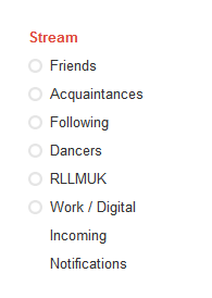
You can also view your incoming stream segmented by Circle very easily with always-exposed controls to the left of it.

​Since Google+ is asymmetric, it’s very possible that other users will have you in their Circles even though they aren’t in yours. Any posts from these people will not show up in your Stream but are collected in a special area called ‘Incoming’, listed on the left below your Circles.

In broad Twitter terms, this is the equivalent of there being a special stream of everyone following you, but who you aren’t following back.

Outgoing
All posts on Google+ must be explicitly targeted. You can post to:

Public
- visible on your Google+ profile page
- shown in the Stream of all users who have you in a Circle
- shown in the Incoming area of all users you have in a Circle who don't have you in a Circle

Extended Circles
- shown in the Stream of all users who have you in a Circle
- shown in the Incoming area of all users in the Circles of users in your Circles ***
- shown in the Incoming area of all the users you have in a Circle who don't reciprocally have you in a Circle

Your Circles
- shown in the Stream of all users you have in any of your Circles who also have you in one of their Circles
- shown in the Incoming area of all the users you have in a Circle who don't reciprocally have you in a Circle

A particular Circle
- shown in the Stream of all users in that Circle who also have you in one of their Circles
- shown in the Incoming area of all the users in that Circle who don't reciprocally have you in a Circle

A particular user or users
- shown in the Stream of that user if they have you in one of their Circles
- shown in the Incoming area of that user if they don't reciprocally have you in a Circle

Or... any combination of the above.

Perhaps the most important thing to note is that having users in your Circles doesn't mean you can predict how they are dealing with or if they will even see your posts - that depends most on whether they have reciprocally included you in a Circle or not.

Summary

Facebook, Twitter and Google+ all implement fundamentally different sharing models.

Google+ definitely provides something new but it does so via a model that (perhaps necessarily) is more difficult to fully build a mental model of than the other two services.

Both Twitter and Facebook offer progressive levels of complexity – Facebook Friend Lists and Twitter Lists are both power user-y features that the majority of users don’t need or use (though in Facebook’s case this is doubtless partly because the interface for doing so is both poorly designed and well hidden).

Google+ brings this type of functionality to the core of its service, requiring users to understand something a little more complex before they can even use the service at all. On the upside, it also brings a much slicker user experience to group management along with it.

Whether this added complexity will materially affect take up, or limit it to more technically savvy users is yet to be seen.

* 99% of the time anyway: privacy settings, posting on other people’s “wall”s, excepted.
** I’m ignoring people who protect their tweets - this is a niche use case and not really in the spirit of Twitter anyway.
*** It’s actually more complicated even than that: [removed: link now dead]